
Today I’m sharing a layout here and over on the Studio Calico blog that was inspired by a page in the Member Gallery by Pam:
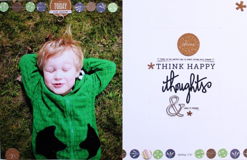
It’s likely not much of a surprise to you guys that I like two-page layouts that incorporate a full-page photo. It’s hard to beat the visual impact that comes from an enlarged photo.
On Pam’s page I especially liked all the white space on the second page, the enlarged type (part of a phrase) and the stitched circles across the bottom and the top.
With those design elements in mind I looked at my list of layouts I want to make and decided to get the story of Anna’s first soccer season into layout form.
As you probably know by now, I like to blog many of my stories first and then turn them into layouts. Why? Usually it’s because I get more of the story told since I’m focusing on the words first and then creating a design to fit my words vs. making my words fit my design. Obviously I don’t do this for every story or every layout, but the ones where I tell a more complete story tend to be my favorites.
Here’s a look at what I came up with (video follows with a walk-through below):

This is a 4-page layout. Here’s a break down:
- One full page 8.5×11 photo
- One full page of pattern vellum + labels
- One photo collage (front and back) that measures 5 x 11
- One 8.5×11 page of journaling

The full page photo includes just a few embellishments added to the bottom left corner. These include phase stickers from the following sets: Pink Paislee Sunshine Collection, Studio Calico South Of Market Phrase Stickers, and Cosmo Cricket Punch Me Tiny Text.
In addition I added a little white star sequin attached with a small silver brad.
On the front side of the pattern vellum I added my title. The font I used is My Underwood (I say it wrong in the video).

When you turn the vellum over I’ve repeated the same label shape with a different collection of embellishments.

Using the punched out section of the gold-rimmed label (see video for visual) I traced the area and then cut it out of the Turnip The Beet pattern paper. On top of that I layered another sticker from the Pink Paislee set and added another star/brad combo.
I like repetition.
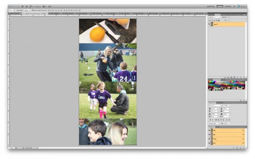
The next page in the layout is 2, 5 inch x 11 inch photo collages I put together in Photoshop. I printed them on photo paper and then adhered them back to back. For printing at home I use an Epson R2000.

After adhering the two photo collages back to back I slipped them into a 8.5×11 page protector. To make the page protector a custom size I placed it on my trimmer (with the photo page inside) and cut it, leaving about 1/4 inch of space along the edge. To seal up the page I used some star washi tape.
A single circle chipboard embellishment was added to the front of the photo collage. These were from an embellishment kit at Studio Calico that is no longer available.

The backside of the photo collage page includes a few more of the phrase stickers and another small white star/brad combo.

Along the edge I added a 2-inch plastic tab and stamped “just awesome” using my Just Awesome stamp set + Mint Hint ink.

And the last page is the full story. As I mention in the video below I originally intended to fit the journaling into about the same amount of space as Pam took up for her title in the inspiration layout. Once I started flowing my text in from the blog post it was obvious it was going to need more space.
I know including this much text isn’t for everyone, but man it has my heart.
VIDEO OVERVIEW
In case you are interested, the green Copic marker I used is from this set and the plain 8.5 inch x 11 inch vellum I used in the video that I didn’t end up incorporating into the layout.
SUPPLIES | LOVE WATCHING YOU PLAY
Click on the images to jump to the products.
 |
 |
 |
 |
 |
 |
 |
 |
|
|
 |
 |
 |
|
|
|


